Eat Smart
For decades, Eat Smart has been at the forefront of fresh produce innovation in the United States and Canada, and one of the leading brands in the category. But over time, competitors filled produce aisles with similar, undifferentiated products associated with images of heritage, nostalgia and bargain prices.
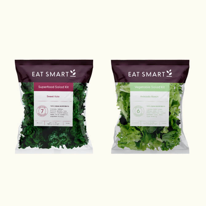
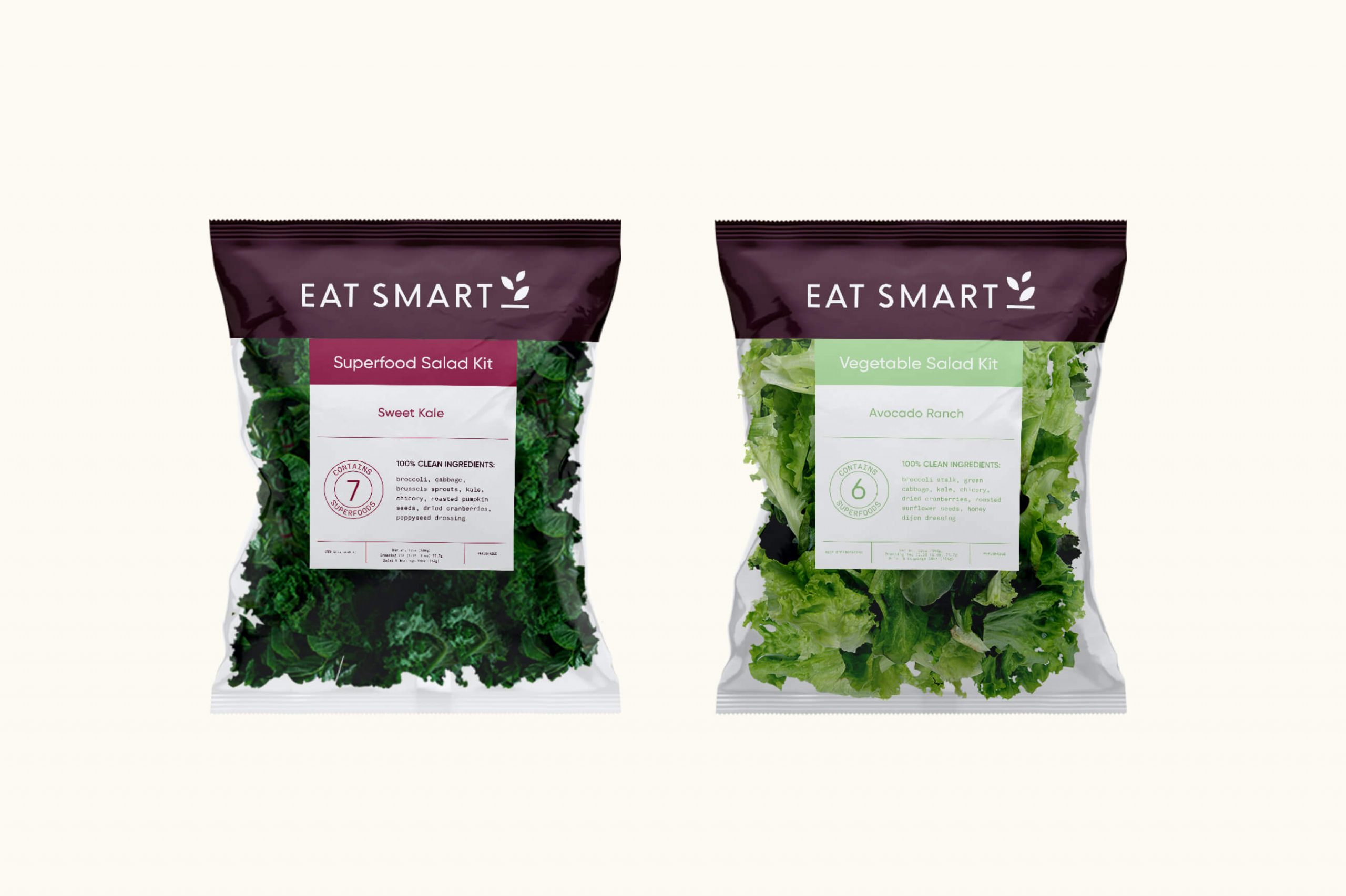
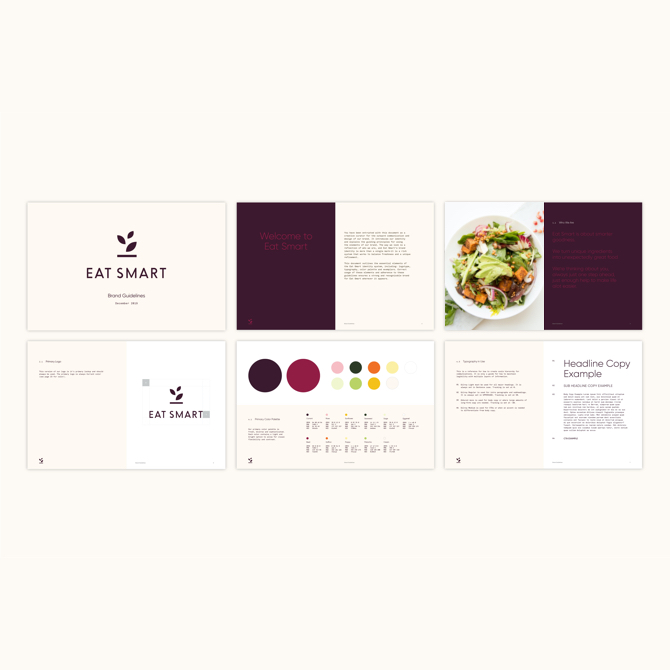
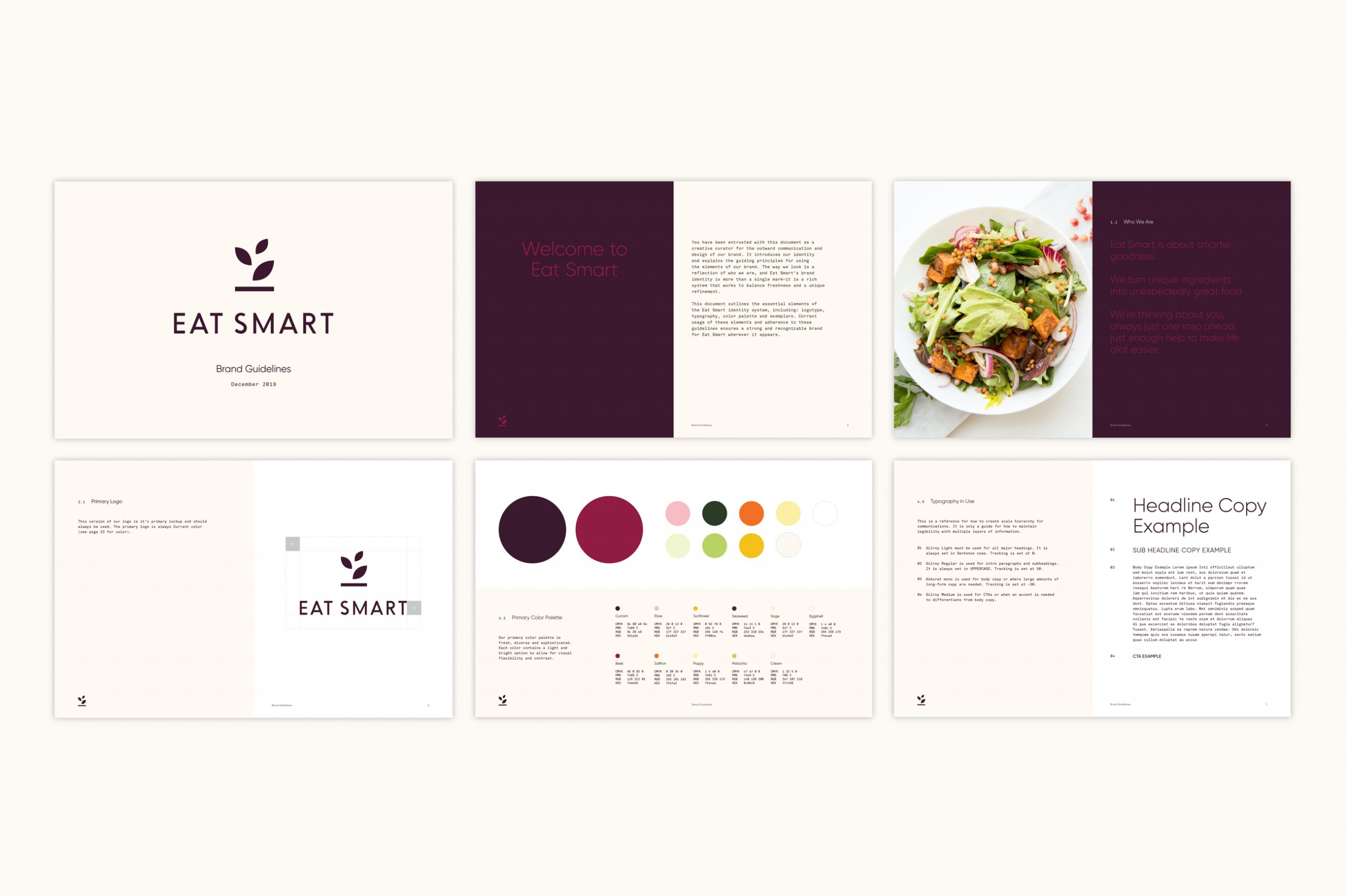
We worked with Eat Smart to renew their brand identity, product portfolio and packaging in ways that both align with and elevate the way customers “make healthy happen” as they bring fresh salad kits and prepared produce to their kitchen tables.
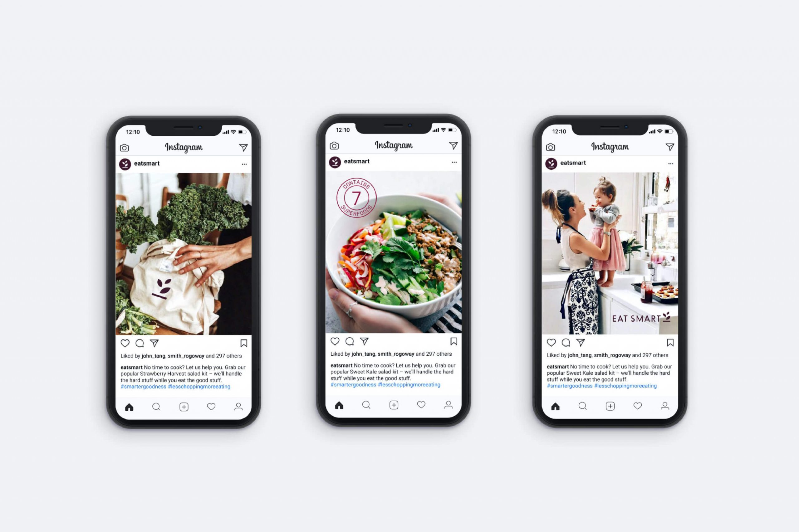
The renewed brand position for Eat Smart is centered on the idea of Smarter Goodness—emphasizing a history of product innovation and commitment to making high quality produce as easy as possible to serve and enjoy. Straight-forward, modern, refreshingly simple, Smarter Goodness is about taking the guesswork out of eating healthy and letting the ingredients speak for themselves.
With a large product portfolio, Eat Smart customers could sometimes struggle to find their way among numerous product names and messages. In response, we conducted a process leading to a useful simplification of names and descriptions, using words that are 100% descriptive of the product. With the new system, customers can more easily identify the exact ingredients they will be getting within every packaged product.
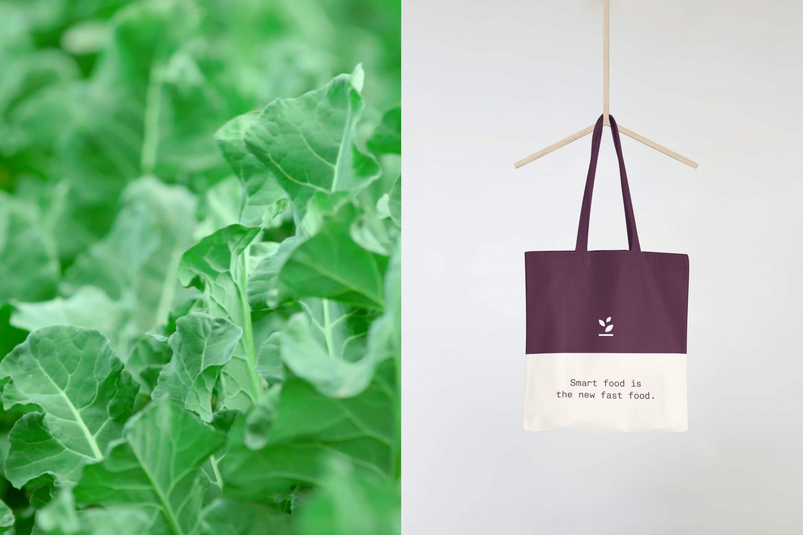
The new design system also delivers on the Smarter Goodness story visually. By stripping away extra text, simplifying the graphic elements, and focusing on the core essentials of the leaf and lines, the design of packaging echoes the values of straight-forward simplicity and modern elegance. The result is an overall brand impression that feels intelligent, bright and engaging.
Services
Brand Identity
Packaging
Strategy


